

Fostering sustainable, inclusive growth —driving positive change for our communities, healthcare system, environment and future.
.png)

MaRS is an established innovation ecosystem in Canada. We support startups focused on impact areas including climate, health sciences, and applied AI. We have strong relationships with the public sector, helping these industries navigate heavy bureaucracy — removing barriers to entry and adoption. We also work with corporations who need i.e. solutions to meet their climate objectives, bringing these customers to startups. This was poorly communicated on the previous website, built over five years ago.
We needed a refreshed website to clearly communicate MaRS’ services to drive quality startup applications and partner inquiries.
The scope of this project includes the Home, Startup, and Partner landing pages. The previous pages lacked a conversion funnel without intentional call-to-actions. For starters, it was very difficult for founders to find our application button. The information has also become outdated after five years of reprioritization and restructuring.

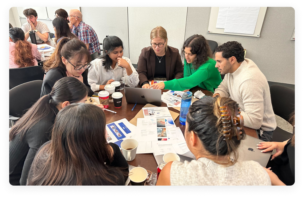
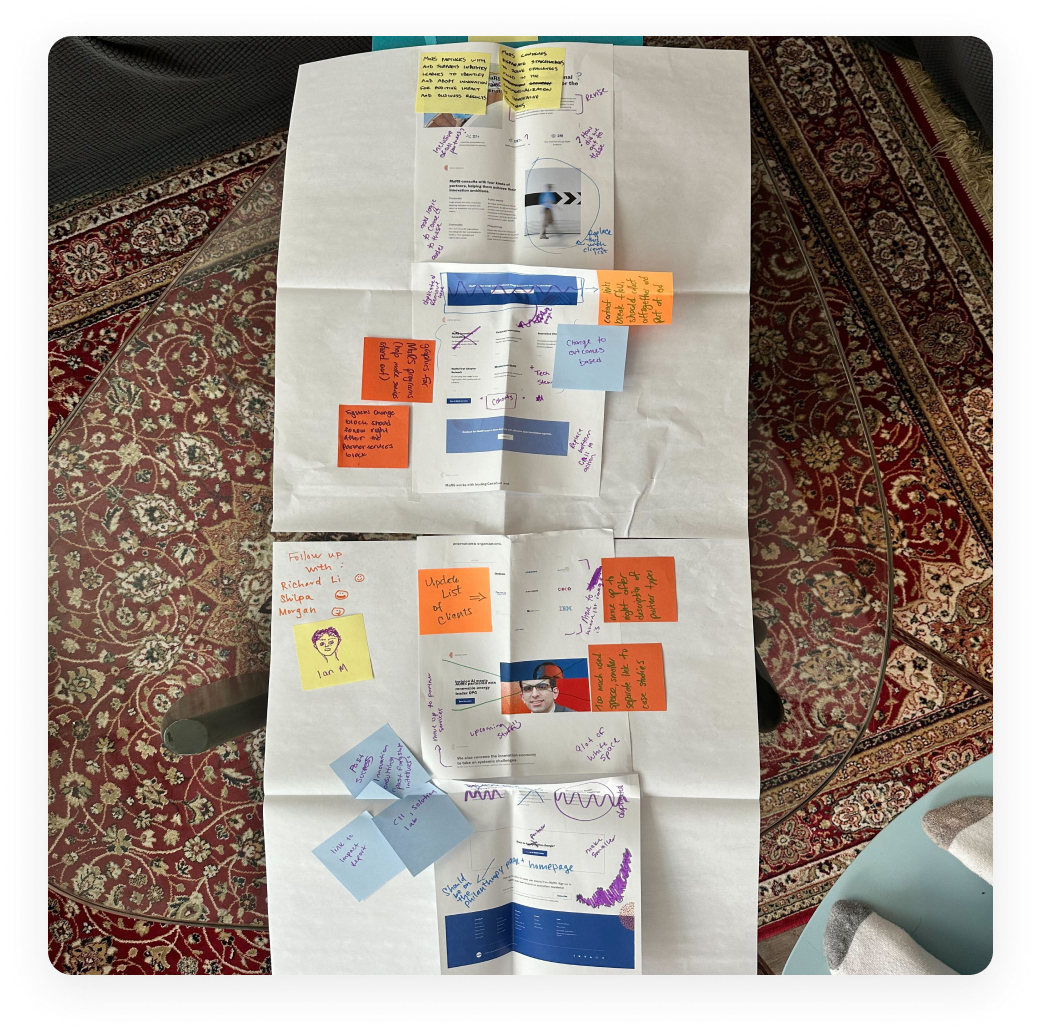
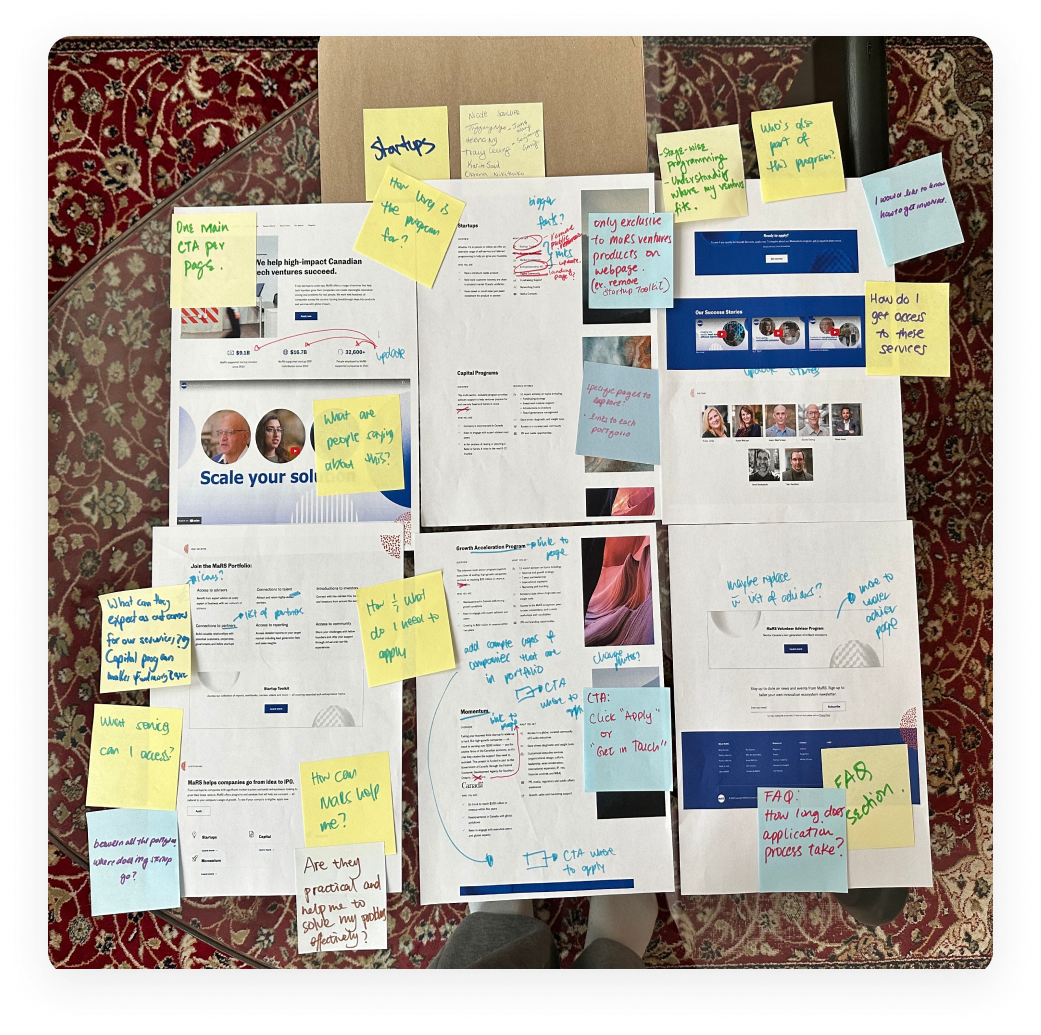
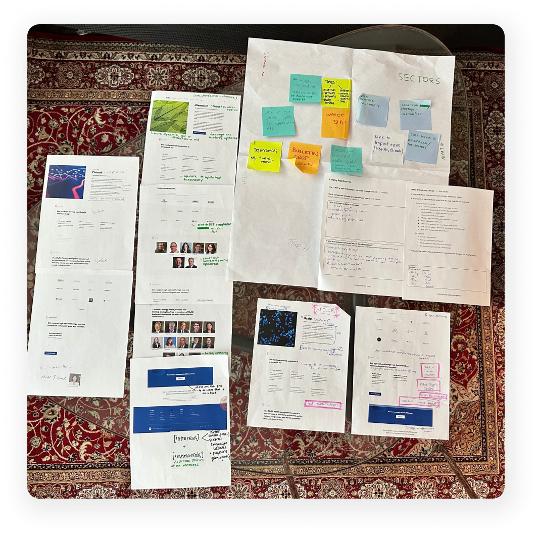
MaRS has a very bright and opinionated team. Leadership wanted to ensure that everyone’s opinions felt heard and prompted me to facilitate an in-person workshop for over 70 teammates in our department.
Each table got a single print-out of one of 3 pages. People assigned themselves to the table they brought the most context to, defined the audience and their intention, and marked up changes and improvements using sticky notes.
I synthesized the feedback directly into Figma designs, imported using an HTML to Figma plugin.
With working on a project of this scale I learned a lot that will change the way I work in the future.
Working within an existing Wordpress website
The problem we are tackling is largely a communications challenge due to the fact that there were many design constraints. With only three pages being updated, it still needed to holistically fit with the rest of the website. I found the existing Wordpress components to be far too limiting. I had to work with our developer to ensure new components were straight forward enough, so we could meet the timelines.
Short timelines and large functional team
With just two months to get design, copy, and development complete, we are leaning on making iterative improvements after we launch. This was a very high risk and visibility project right before the holidays. (See Acknowledgements).
I had two weeks to get layouts locked-in as they informed both copy and development. Our copywriter and developer immediately spent the next month working away as I worked through the visuals and QA.
This project was equally an organizational alignment project as it was a website refresh. I was given little context to start. I had to navigate the ambiguity and gathered the leadership team around a first draft, using a sitemap and wireframes. This inspired a lot of intense discussion to inform the second draft.
.png)
The top navigation is broken down by our various target audiences including Startups, Partners, Investors, and Real Estate (tenants and event hosts). I then referenced Google Analytics to ensure that we were still catering to our most visited pages.
Data-Informed Decisions
Our careers page gets heavy traffic. Despite not being tied to a direct metric, we included this into the top-nav. Our content pieces are also a hit. We drive traffic to this on every page.
Clear Language
The previous labels led with internal jargon. We shortened many labels to read more concisely. Including changing “Magazine” to “News”.
Driving Revenue
With real estate being our only for-profit area of business, we need to prioritize that in our primary nav.

The previously separated categories (About, Resources, and Contact) made it difficult for end-users to discover the specific pages catered to their unique needs.
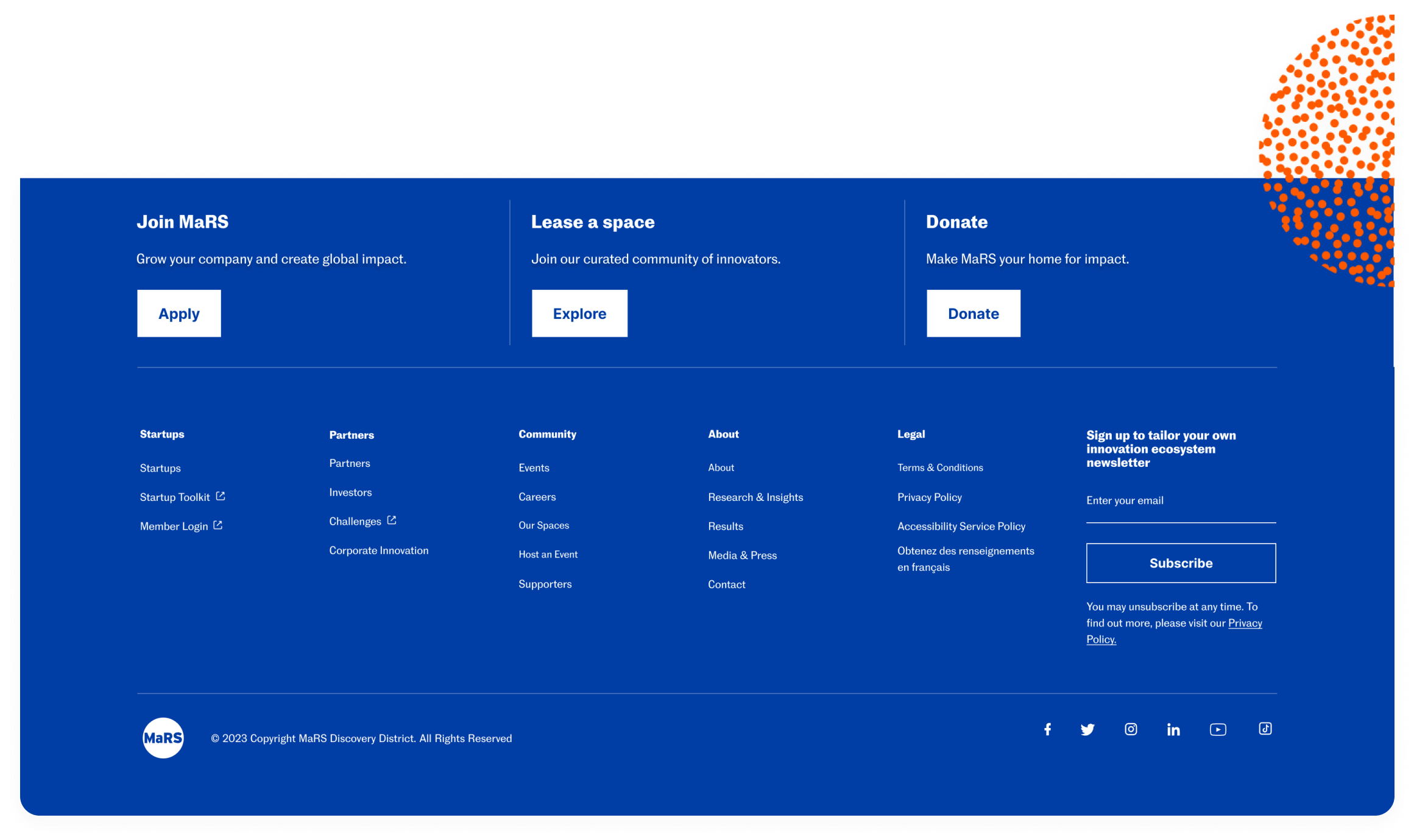
Introducing Top Footer
We added three call to actions to a new top footer. Speaking to the various stakeholders MaRS serves.
Sort by End-User
We now sort the footer navigation by Startups, Partners, Community, and About.
Newsletter Signup
We moved the Newsletter Signup into the footer, continuing to drive people to our deep investment in quality content.
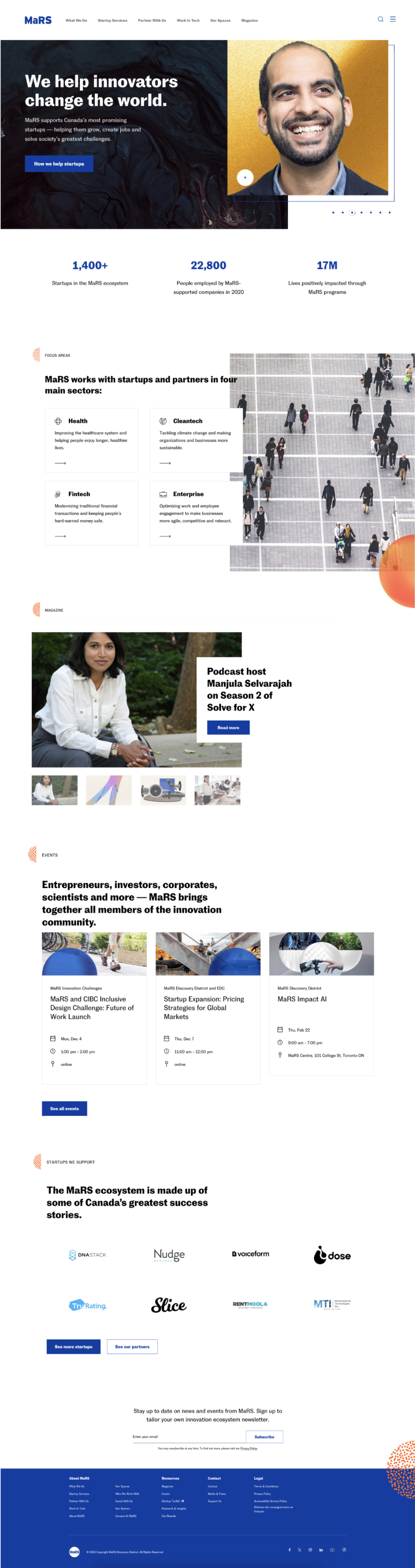
We cater to various stakeholders. This includes startup founders, real estate tenants, event hosts, government partners, corporate partners, and more. This page acts as an overview for each stakeholder to find the relevant page and information to them.
Social proof
Featuring startups and how we helped them in their journey. We also introduced brand logos to help partners self-identify themselves.
Impact areas
The company has aligned on three refined impact areas: Climate, Health Sciences, and Applied AI.
Balancing priorities
With a number of users to serve, we must consider the amount of real-estate and hierarchy in how we inform them.
We had direct feedback that the application form was difficult to find. The main metric is to improve the number of quality applications we receive. In order to do this, we improved the communication strategy of the programs we offer and ways we serve startups.
Social proof
Success stories, testimonial videos, and featured startups in the range of programs we offer.
FAQ
Introducing an accordion to directly answer common questions, reducing friction prior to a founder applying.
Apply to MaRS
Making the application button accessible in a number of places throughout the page.
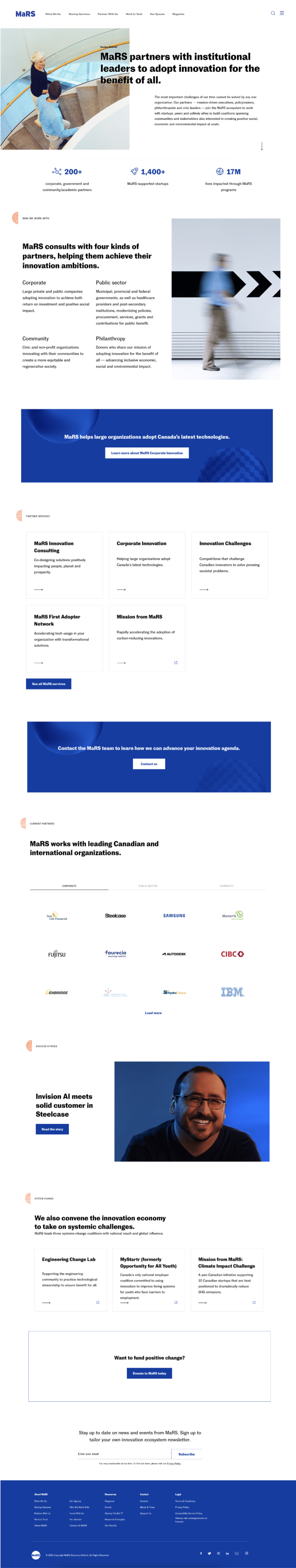
We want to use this page to inspire prospective partners in what is capable through a MaRS partnership. The main metric is to drive intake inquires for partnership opportunities.
No one-size-fits-all
We serve a range of partners from investors, corporations, and service providers.
Social proof
We use testimonials and company logos to help people self-identify similar companies.
Contact form
We use a form to drive inbound leads to our partnership team that didn’t historically exist.
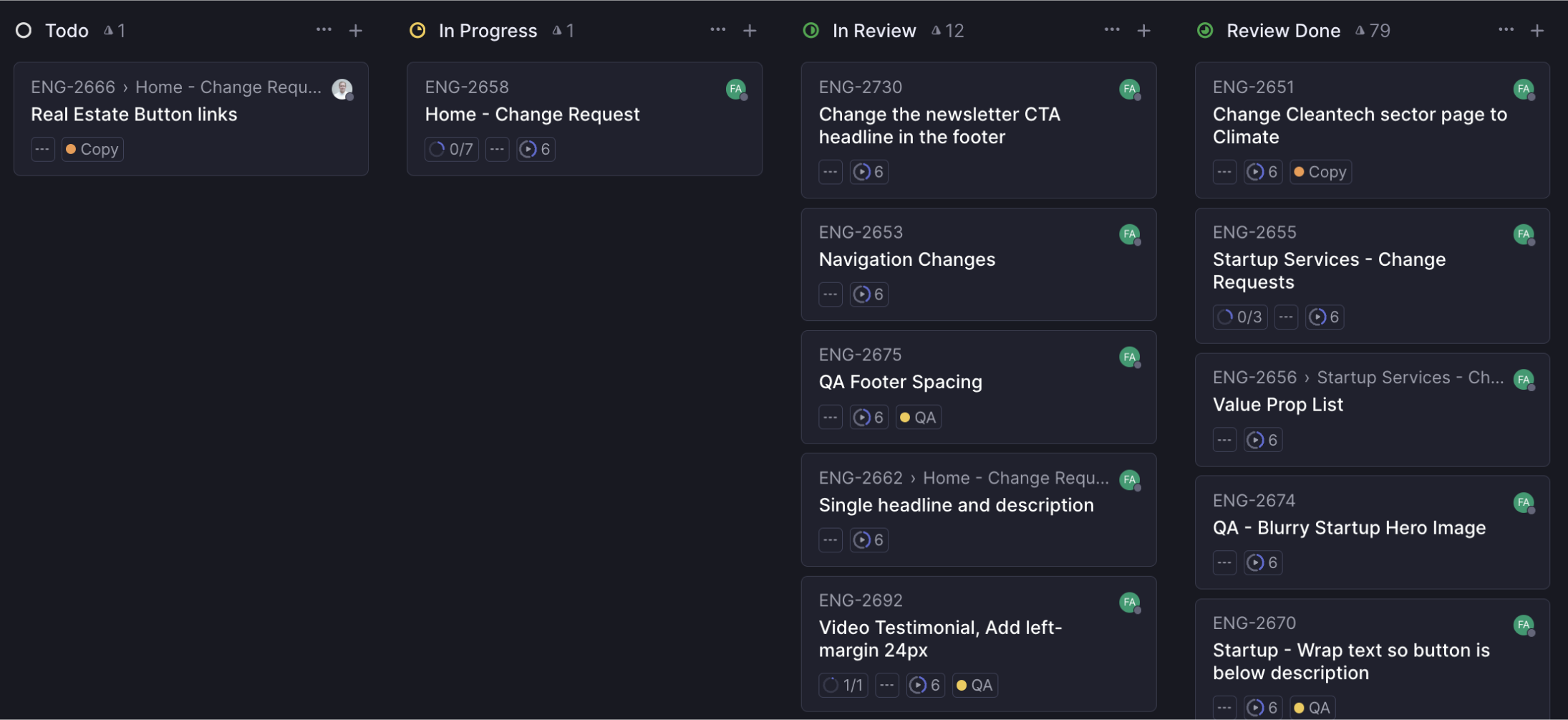
As each page was approved, I began handing off designs to our front-end developer; Writing development and completing same-day QA on Linear. With a foundational knowledge of CSS and HTML, I want to ensure we launch quality and polished designs.
We have set up Google Analytics dashboard to measure the conversions on key metrics:
Annual number of startup applications comparison
Bounce rate comparison
Time spent on page comparison
Number of inbound partnership inquiries
Are users navigating through the information flow as intended?
Phase 2 will include a few more page updates and site-wide changes to the typography to meet accessibility standards. This iterative process will include continuous QA to improve the mobile experience and more cohesive visuals.
@Renee, our copywriter and editor extraordinaire, has been tirelessly working on making sure our messaging is showing the immense impact that MaRS has in the innovation ecosystem.
@Fadi, our genius software engineer, has been instrumental to bringing the website refresh to life and ensuring everything functions the way it’s supposed to.
@Oksana, wrangling all the key players in an organization that can be silohed.
@Aislinn, our project leader, has been crucial in coordinating and managing this project.